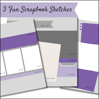
Using strips of designer series paper along with cutting out images from the designer series paper you can create a fun layout like I have above. The main piece of paper I chose from the Ice Cream Corner DSP makes me think of drizzled chocolate. What do you think? To finish off this layout you could use one 4" x 6" picture or even add another photo to the right of the white photo layer.
This layout is my favourite of all 6 layouts we created. And that's because it is mainly purple! A hard choice for me though is to decide if I like soft cone ice cream or hard scoop ice cream better? If you had a choice, which would you choose?
Layout 1 Product List - click on any of the pictures below to be taken to my online store to pick up the supplies you need to recreate this project.
Thank you for stopping by! ~ Amanda


Add your comment
Thank you for stopping by today! If you see something you like leave me a comment.