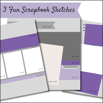
The hardest part for me with sketches is finding the right photo to use.
I went digging through my old photos to find this one of my family when we were camping somewhere. Haven't figured out what date (1988??) or where it was yet, so no
journaling. I love that I have a swim ring on and a visor!
I used a sheet from the Country Club Designer Series Paper on top of a piece of 12" x 12" Basic Gray card stock. To create my beach theme I used the Sea of Textures stamp set and the Under the Sea dies. The colours are pulled from both the designer series paper - Night of Navy and Garden Green, and from the photo - Cajun Craze and Seaside Spray.
Supplies (click on the photo to add these items to your cart)
Thank you for stopping by! Next you will visit Libby's blog.
~ Amanda
Blog Hop Roll Call
Sale-A-Bration is here! Spend $60 before shipping and taxes to earn a FREE Sale-A-Bration item! Shop online with me: https://amandafarlinger.stampinup.net
Join me on Instagram: www.Instagram.com/FromWhereIStamp
My resolution this
year is to do more scrapbooking! Are you like me and have pictures that you
need some help and motivation to scrapbook? Join me every week! I’ll share some
tips and inspiration to help us work towards creating more pages and getting
those pictures scrapped!


I find it funny when people say that finding the photo is always the hardest part... If I don't have the photo I cannot create as I don't know what colours to use...Journalling is hard for me too.
ReplyDeleteThanks for joining in the Blog Hop again this month
Cheers Shaz
Yep Im the same too
DeleteLove what you have done with those legs! I need the right photo as well - I don't know hope people can scrap without a photo it would be super hard.
ReplyDeleteLove the colours you used!
ReplyDeleteLove your take on the sketch! Your photo really suits this paper and embellishments
ReplyDeleteLove the way you interpreted this sketch... great job!
ReplyDeleteA really good way to interpret the sketch, Amanda. The colours look great. Thanks for sharing
ReplyDeleteThis is awesome! I love your colours!
ReplyDeleteLove your page! My favorite part is the way you've use the octopus legs as an accent - they make such a fun border!!
ReplyDeleteThis is a super cool page! It made me smile because of the 'Retro Photo - a true classic! AND you embellished it perfectly to continue with theme. I love it!!!
ReplyDeleteDefinitely a cute photo, lol. And those octopus, love them!
ReplyDeleteOh this is so fun - love the octopus leg detail under the photo - that's so cool! And fun and bright and happy! Great title for your page too.
ReplyDelete