I had some time last night to play with some of my new stamping goodies and decided to do a challenge over at Splitcoaststampers: Monday's demonstratable card challenge. Our challenge was to case a card from the Summer Mini Catalogue on page 16A. I also gave myself a little challenge to pick colours for my card only from the Brights Collection.
To create the tiled look: I started out with a 3" square of white, then stamped the floral image using Black Stazon. This was coloured in using a blender pen and ink, then with a few Stampin' Write markers. The square was cut into four equal parts, dimensionals added to the back and arranged on the card.
Supplies
Stamps: Elements of Style, Thank You Kindly
Ink: Tempting Turquoise, Daffodil Delight, Black Stazon
Paper: Tempting Turquoise, Daffodil Delight, Whisper White
Accessories: Daffodil Delight and Old Olive Markers, blender pen, 1-1/4" Daffodil Delight grosgrain ribbon, 5/8" Old Olive grosgrain ribbon, stamping dimensionals, sticky strip, retired button, decorative label punch (punch available in the upcoming Holiday Mini)
~Amanda
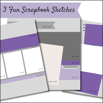
Free 3 Scrapbook Sketches
Search

Oct 2023 - I'm celebrating 8 years as a Stampin' Up! demonstrator
Featured Post
Contact Form
All stamps, paper and inks used are © Stampin' Up!® unless otherwise stated. All images and designs are copyright of Amanda Farlinger unless otherwise stated.
This is a personal web site of Amanda Farlinger, an Independent Stampin' Up! Demonstrator, and I am responsible for its content. Stampin' Up! does not endorse the use of or contents of the classes, services, or non-Stampin' Up! products I may offer here.
This is a personal web site of Amanda Farlinger, an Independent Stampin' Up! Demonstrator, and I am responsible for its content. Stampin' Up! does not endorse the use of or contents of the classes, services, or non-Stampin' Up! products I may offer here.
© From Where I Stamp by Amanda Farlinger · THEME BY WATDESIGNEXPRESS


Great card, love the window look and the ribbon.
ReplyDeleteI love the window look and the colors you chose are great together! I really love the new punch peaking out the side too.
ReplyDeleteA very pretty card, I love the layout. Isn't it funny how we overlook all the great ideas in our catalog.
ReplyDeleteThanks for sharing,
Kim
Very nice! Love the colours you chose!
ReplyDeleteLove it!!! I've never tried a "window" look, but you have inspried me to try it out.
ReplyDelete